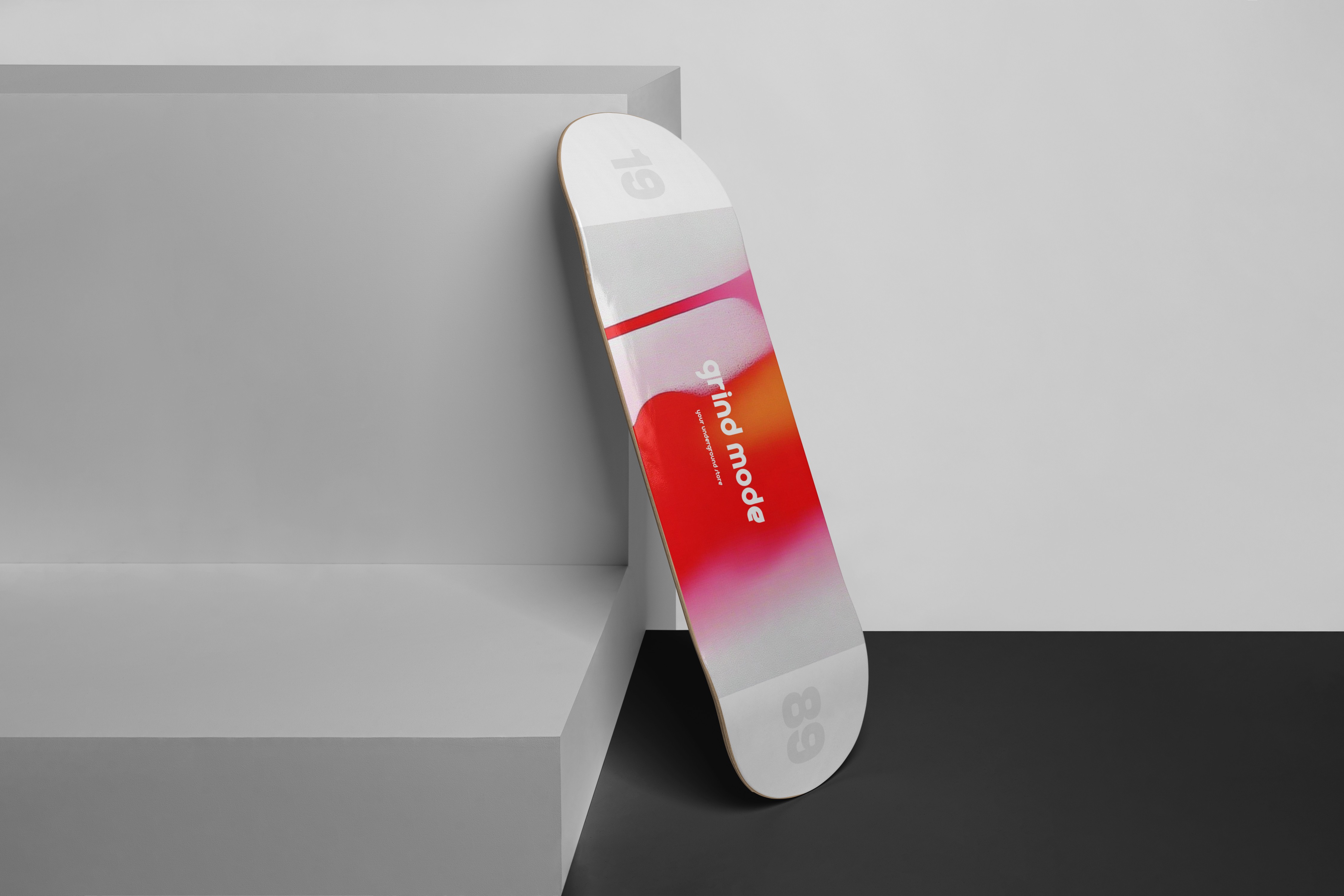
Grind Mode

Grind Mode’s identity is a study in duality — silence and disruption, structure and chaos. Built on contrast and intention, it elevates an underground fashion brand.

Category:

Visual Identity

Visual Identity

Charmant 01
Charmant 01
Charmant 01

My Approach

With Grind Mode, the goal was to create a visual identity that balances raw rebellion with calculated restraint. The design uses minimal forms and typography as a quiet framework, disrupted by a bold, fluid red motif — a symbol of movement, urgency, and underground energy. Every element is deliberate: reduced graphics, strong negative space, and one dominating visual accent that becomes the brand’s core signature.

Vision and Innovation

Grind Mode speaks to a subculture that rejects polish in favor of authenticity. The identity leverages minimalism not for neutrality, but as a contrast to the visceral, bleeding red mark — a controlled act of rebellion. The packaging, photography, and layout systems are intentionally stripped-down to amplify that contrast, letting the mark act as both logo and attitude.

Charmant 02
Charmant 02
Charmant 02
Charmant 03
Charmant 03

Resolving Complex Problems

The challenge was to build a visual system that feels underground and anti-mainstream, but still refined enough for consistent digital and physical execution. This was achieved through modular layout structures, a neutral typographic system, and a single expressive gesture — the red spill — which adapts across formats without losing its intensity.

User-Centric Design

Although Grind Mode operates in the underground space, usability was never compromised. The identity is scalable, print-ready, and screen-conscious, maintaining clarity in small-scale prints, e-commerce listings, and environmental signage. The result is a system that supports both the product and the cultural energy behind it.

Meeting Brand and Market Needs

Grind Mode connects with a niche, but visually literate audience — those who look for substance under surface. The brand identity reflects this by removing the noise and letting one strong message cut through: you don’t need to shout to be heard. The red becomes both a symbol and a stance.

Charmant 02
Charmant 03
Charmant 03